Mobile First Website Design Principles: The 2026 Strategy for Business Growth
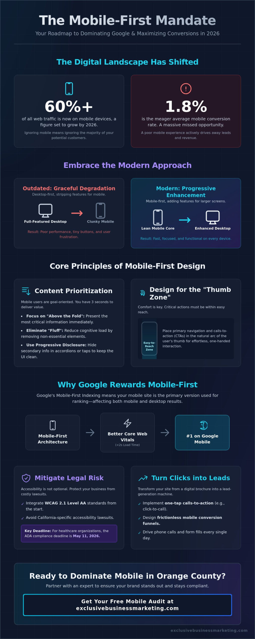
Over 57% of all web traffic in the United States now originates from mobile devices, yet the average mobile conversion rate remains stuck at a meager 1.8%. It’s likely you’ve felt the sting of high bounce rates or the stress of trying to keep up with shifting legal standards, such as the May 11, 2026, ADA deadline for healthcare organizations. You’re right to be concerned about losing leads to faster competitors who have already optimized their digital presence. This guide provides a clear roadmap to master the mobile first website design principles that will secure your #1 spot on Google mobile search and maximize your bottom line.
We understand you need a website that works as hard as you do. You’ll learn how to implement thumb-first interaction design and achieve the critical 2-second load time benchmark that modern users demand. We’ll also cover the exact WCAG 2.1 Level AA requirements to protect your business from legal risks while ensuring every visitor has a seamless experience. Let’s transform your mobile site from a digital liability into a high-performing growth engine that drives phone calls and form fills every single day.
Key Takeaways
- Understand why shifting from graceful degradation to progressive enhancement is the essential foundation for any modern growth strategy.
- Master the core mobile first website design principles like content inventory and visual hierarchy to guide users effortlessly toward your goals.
- Learn how to safeguard your business from California-specific accessibility lawsuits by integrating WCAG standards into your mobile interface.
- Discover how to transform your site into a lead-generation machine using one-tap calls to action and optimized mobile conversion funnels.
- Gain insights on why partnering with an Orange County expert ensures your brand dominates local search while remaining fully compliant.
What is Mobile-First Website Design? (And Why It Is Non-Negotiable in 2026)
Mobile-first website design is the strategy of sketching, prototyping, and coding your digital presence for the smallest screens before even considering the desktop version. It’s a fundamental shift in how we build for the modern consumer. In 2026, over 60% of all web traffic is mobile-driven. If your business still treats mobile as an afterthought, you’re essentially ignoring the majority of your potential customers. This approach forces you to identify your most critical content and functions immediately. It ensures your core message isn’t lost in the clutter of a sidebar or a massive hero image that takes forever to load on a 5G connection.
We’ve moved past the era of graceful degradation, where developers built a complex desktop site and then stripped away features for smaller screens. Today, we practice progressive enhancement. This means we start with a lean, high-performance mobile foundation and then add layers of complexity as screen real estate increases. By focusing on mobile first website design principles, you ensure that every user gets a fast, functional, and focused experience regardless of their device. It’s about being proactive rather than reactive.
Expert digital agencies such as Synapse Worldwide apply these principles to ensure that every aspect of a site—from development to marketing—is built to perform in an increasingly mobile-centric world.
If you are researching experienced firms to help with your digital transition, you can learn more about ImageWorks Creative and their approach to high-performance branding and design.
Mobile-First vs. Responsive Design: The Critical Difference
Many business owners confuse these two concepts. While they share similarities, the intent is different. Standard Responsive Web Design principles often focus on adapting a large desktop site to fit a smaller screen. This “shrinking” often leads to poor performance, tiny buttons, and user frustration. Mobile-first design flips the script by building from the palm of the hand outward. Designing for constraints like limited space and touch-based navigation forces better business decisions. You can’t hide a weak value proposition behind flashy desktop animations. Every pixel must earn its place, which naturally leads to higher conversion rates and clearer messaging.
The SEO Impact of Mobile-First Architecture
Google doesn’t just prefer mobile-friendly sites; it uses them as the benchmark for your entire digital reputation. Mobile-first indexing is the primary way Google evaluates your site. If your mobile architecture is flawed, your desktop rankings will suffer too. A mobile-first structure significantly improves your Core Web Vitals scores by reducing unnecessary code and prioritizing load speeds. This technical efficiency is a massive advantage for orange county seo rankings, where local competition is fierce. When you prioritize mobile first website design principles, you’re telling search engines that you value the user’s time and accessibility. This level of professional certification in your design approach builds immediate trust with both Google and your future clients.
The 5 Core Principles of Mobile-First Design
Implementing a successful mobile strategy requires more than just making elements smaller. It demands a complete shift in how you organize and present your business value. When we apply mobile first website design principles, we start by stripping away the noise. We identify the “Must-Haves” for your mobile user and ensure those elements are front and center. This methodical approach transforms your site from a static digital brochure into a high-performance lead generation tool. It’s about creating a streamlined path that guides your visitors toward a phone call or a form fill without any friction.
Content Prioritization: The “Above the Fold” Rule
Mobile users are goal-oriented and often in a hurry. You have approximately 3 seconds to prove your site has the answer they need. This makes content inventory your first priority. We eliminate the “fluff” that clutters desktop screens to reduce cognitive load. By using progressive disclosure, we keep your primary message clear while hiding secondary information behind intuitive taps or accordions. This keeps the user engaged and prevents them from feeling overwhelmed by walls of text. If you’re looking for a partner to audit your current layout, our team at Exclusive Business Marketing can help you refine your mobile message for maximum impact.
Designing for the “Thumb Zone”
User comfort is a non-negotiable design principle. The “Thumb Zone” refers to the area of a phone screen that a user can easily reach with their thumb while holding the device with one hand. We place your most critical calls-to-action within this safe zone to drive engagement. To ensure a frustration-free experience, we follow strict industry standards for tap targets. While Apple recommends a minimum size of 44×44 pixels, Google suggests 48×48 pixels for optimal usability. Proper spacing between these elements is equally vital to prevent accidental clicks that lead to high bounce rates. These mobile-first website design tips highlight how physical ergonomics must dictate your digital layout.
Speed as a Design Principle
In 2026, performance is the ultimate user experience metric. Research shows that users expect near-instantaneous results. A key performance goal for this year is achieving a 2-second load time on mid-range mobile devices. We achieve this by prioritizing clean code and modern image optimization techniques, such as using WebP formats and implementing lazy loading. These mobile first website design principles ensure that heavy assets don’t choke your bandwidth. When your site loads instantly, you build immediate trust and keep potential leads from jumping to a competitor’s faster site. High-speed performance isn’t just a technical perk; it’s a core requirement for business growth.
Integrating ADA Compliance into Your Mobile-First Strategy
Mobile accessibility is the new frontier for ada compliant website design. While many competitors treat accessibility as an optional “best practice,” the 2026 legal landscape makes it a core pillar of your digital strategy. This is especially true in California, where businesses face frequent litigation under the Unruh Civil Rights Act for digital barriers. By applying mobile first website design principles with an inclusive lens, you don’t just avoid lawsuits. You open your doors to a wider audience that relies on assistive technology to interact with your brand.
Designing for mobile accessibility requires a deep dive into how users navigate small screens. Your navigation must be entirely screen-reader friendly. This means using proper semantic HTML and ARIA labels so a user can understand your site’s structure without seeing it. We also prioritize font scalability. A user should be able to increase text size by up to 200% without breaking your layout or losing functionality. Color contrast is another non-negotiable. We ensure a minimum contrast ratio of 4.5:1 for standard text, making your content readable for everyone, including those with low vision or those viewing your site in direct sunlight.
WCAG 2.2 Guidelines for Mobile Devices
The latest WCAG 2.2 standards introduce specific rules for mobile interactions. These include orientation requirements, which prevent sites from locking the display to a single mode like portrait or landscape. We also focus on pointer gestures and motion actuation. You must provide alternatives for complex motions like shaking the phone or multi-finger swipes. Accessible design is actually better design for all mobile users because it simplifies the interface and reduces errors. Remember, ADA compliance is a continuous process, not a one-time fix.
The Risk of Non-Compliance in 2026
The stakes have never been higher. As of May 11, 2026, healthcare organizations receiving federal funding must meet strict digital accessibility standards. Mobile accessibility issues are now a top target for legal demand letters across all industries. A single non-compliant button can lead to a costly settlement and damage your brand reputation. We protect your business by integrating accessibility audits directly into your mobile-first design workflow. This proactive approach ensures your site remains a safe, inclusive, and high-performing asset for years to come. By prioritizing mobile first website design principles during the audit phase, we catch potential issues before they become legal liabilities.
Maximizing Mobile Conversions: Turning Visitors into Leads
A beautiful mobile site is useless if it doesn’t generate revenue. While the average mobile eCommerce conversion rate often sits at a meager 1.8%, high-performing businesses use mobile first website design principles to double or even triple that number. We don’t just build digital brochures. We build lead-generation machines. This starts with implementing “One-Tap” calls-to-action (CTAs) for phone calls and directions. Mobile users want immediate results. If they have to copy and paste a phone number, you’ve already lost the lead. We ensure every primary action is a single tap away.
Forms are often where mobile conversions go to die. We optimize your path to lead capture by eliminating every unnecessary field. Reducing form fields significantly lowers friction and increases engagement. We utilize mobile-native features like auto-fill and specialized keyboards for email or phone inputs. This level of detail ensures that your visitors spend less time typing and more time converting. If you’re ready to stop losing leads to a clunky interface, contact our expert marketing agency today to overhaul your conversion strategy.
Mobile AI Chatbots: Your 24/7 Sales Assistant
Mobile users demand instant gratification. AI chatbots bridge the gap between curiosity and conversion by providing immediate answers at any hour. We specialize in installing lightweight chatbots that provide value without obstructing the mobile viewport. These tools use conversational marketing to qualify leads and guide them through your funnel while they’re still on your site. It’s a proactive way to capture data and book appointments without requiring a human to be on standby 24/7. This removes the operational burden from your shoulders while keeping your pipeline full.
Simplifying the Mobile Path to Purchase
Friction is the enemy of the mobile sale. We eliminate hurdles by integrating guest checkouts and mobile-first payment options like Apple Pay and Google Pay. These tools allow users to complete a transaction in seconds using biometric authentication rather than typing in credit card details. We also utilize sticky headers and footers to keep your primary CTA visible at all times, regardless of how far a user scrolls. Finally, we never guess what works. We use rigorous A/B testing on mobile layouts to see exactly which colors, button placements, and headlines drive the most phone calls for your specific brand. Mobile first website design principles demand this level of data-driven precision.
Partnering with a Mobile-First Agency in Orange County
Success in the digital age requires more than just a functional website. It demands a strategic partner who understands the high-stakes environment of the California market. When you choose to work with a local orange county web design expert, you aren’t just buying a layout. You’re investing in a comprehensive growth engine built on proven mobile first website design principles. Our team at Exclusive Business Marketing combines technical SEO, rigorous ADA compliance, and conversion-focused design to ensure your business doesn’t just participate in the market; it dominates it.
We provide a worry-free solution that removes the technical burden from your daily operations. You focus on running your business and handling the influx of new leads. We handle the complex code, the accessibility audits, and the performance optimizations. It’s a partnership built on transparency and measurable outcomes. Are you ready to stop wondering why your competitors are outranking you? The first step is simple. Request a comprehensive mobile and compliance audit to see exactly where your current site is falling short and how we can fix it.
Why Local Expertise Matters for California Businesses
The competitive landscape in Huntington Beach, Irvine, and Newport Beach is unique. California businesses face specific state-level regulations and a consumer base that expects perfection. We ensure your site meets global standards while staying ahead of local legal requirements. You get direct access to a dedicated team that prioritizes your specific business results over generic, one-size-fits-all templates. We understand the local market because we live here. This proximity allows us to be proactive and responsive to your needs at a moment’s notice.
Our Proven Mobile-First Design Process
Our methodology is methodical and fast-paced. We start with a deep-dive strategy and a thorough content inventory to identify your most profitable conversion paths. From there, we move into prototyping and final accessibility testing to ensure every “thumb-ready” element works perfectly. We also integrate our pay per click management services with high-performance mobile landing pages to maximize your ad spend. This holistic approach ensures that every visitor has a seamless experience from the first click to the final form fill. Contact Exclusive Business Marketing today for a free mobile strategy session!
Secure Your Business Future with a Mobile-First Foundation
You now have a clear roadmap to navigate the digital landscape of 2026. Transitioning to a mobile-centric strategy isn’t just about aesthetics; it’s about survival and growth. By implementing mobile first website design principles, you’ve learned how to reduce bounce rates, satisfy Google’s indexing requirements, and protect your brand from accessibility lawsuits. These steps ensure your business remains a leader in a market that demands instant, inclusive, and seamless experiences.
We’re here to help you bridge the gap between your current site and a high-performing lead machine. As certified ADA compliance experts with proven SEO results in Orange County, we handle the technical heavy lifting so you don’t have to. Our team provides full-service digital marketing and video production to tell your story effectively on every screen. It’s time to stop losing leads to faster competitors and start claiming your #1 spot.
Get Your Free Mobile-First & ADA Compliance Audit Today!
Take the first step toward a worry-free digital presence today. We’re ready and waiting to help your business reach its full potential.
Frequently Asked Questions
Is mobile-first design the same as responsive design?
No, mobile-first design is a strategic approach that prioritizes the mobile experience before the desktop version. Responsive design is a technical method that makes a desktop site fit smaller screens. By following mobile first website design principles, you focus on core functionality and content first. This ensures that the most essential business goals are met on the devices your customers use most frequently.
How does mobile-first design affect my website’s SEO rankings?
Mobile-first design is the single most important factor for your SEO because Google primarily uses the mobile version of your site for indexing and ranking. If your mobile experience is slow or hard to navigate, your rankings will drop across all devices. High performance on mobile improves your Core Web Vitals. These metrics are essential for dominating local search results in competitive markets.
Do I need a mobile app if my website is mobile-first?
Not every business requires a dedicated mobile app if their website is built with a mobile-first mindset. A high-quality mobile-first site provides many of the same benefits, such as fast load times and intuitive navigation, without requiring users to download anything. However, we also offer mobile app development for businesses that need deep hardware integration or complex offline functionality to serve their customers.
What are the most common mobile accessibility mistakes?
The most frequent errors include tiny tap targets that lead to accidental clicks and insufficient color contrast for text. Apple recommends a minimum target size of 44×44 pixels, while Google suggests 48×48 pixels for a frustration-free experience. Failing to provide alternative text for images or ignoring screen-reader compatibility also creates significant barriers for users with disabilities. These mistakes lead to high bounce rates and legal risks.
How much does it cost to redesign a website for mobile-first?
The investment for a mobile-first redesign depends on your site’s scale and the complexity of your business goals. A professional redesign involves custom strategy, SEO integration, and full ADA compliance testing. While costs in high-demand regions can vary, the return on investment comes through increased conversion rates and reduced legal liability. We provide tailored quotes based on your specific operational needs and growth targets.
Can I convert my existing desktop-first site to mobile-first?
You can certainly transition a desktop-first site, but it usually involves more than just a quick cosmetic fix. It requires re-evaluating your content hierarchy and optimizing your code for performance. Our team handles this process by conducting a thorough audit and then rebuilding your site’s architecture. This ensures that your new foundation follows modern mobile first website design principles to drive tangible growth and measurable results.
What are the WCAG requirements for mobile websites in 2026?
The Department of Justice has established WCAG 2.1 Level AA as the technical standard for digital content. By April 24, 2026, many public entities must comply with these rules to ensure equal access. These requirements include ensuring your site works in both portrait and landscape modes and providing accessible alternatives for motion-based interactions. Staying compliant is a continuous commitment that protects your business from demand letters and litigation.
Why is page speed more critical on mobile than on desktop?
Mobile users often browse on the go with variable network connections, making every millisecond count toward your bottom line. While desktop users might tolerate a slight delay, mobile visitors have a much higher abandonment rate if a site takes over 3 seconds to load. Performance is a core pillar of user experience. Achieving a 2-second load time on mid-range devices is a critical benchmark for capturing leads before they bounce to a competitor.